/* ========================================================= ACO — VAILLANT-STYLE PRODUCT PAGE Same layout / sizing system as the reference ========================================================= */ :root{ --aco-red:#c8232b; --aco-dark-red:#a91f27; --aco-dgrey:#57585a; --aco-gray:#777b7d; --aco-light:#9fa2a4; --aco-dark:#222; --aco-muted:#9f9e9e; --aco-line:#c4c4c4; --aco-soft:#f7f7f9; --aco-link:#0088e3; } .hg-aco{ font-family:"Afacad Flux",Arial,sans-serif; color:var(--aco-dark); background:#fff; overflow:hidden; } .hg-aco *, .hg-aco *::before, .hg-aco *::after{ box-sizing:border-box; } .hg-aco .hg-v-wrap{ width:100%; max-width:1520px; margin:0 auto; padding-left:6.3vw; padding-right:6.3vw; } /* ========================================================= HERO ========================================================= */ .hg-aco .hg-v-hero{ width:100%; height:637px; background-size:cover; background-position:center center; background-repeat:no-repeat; } /* ========================================================= COMPANY INTRO ========================================================= */ .hg-aco .hg-v-intro{ background:#fff; padding:56px 0 58px; } .hg-aco .hg-v-intro-grid{ display:grid; grid-template-columns:1.75fr .55fr; gap:70px; align-items:start; } .hg-aco .hg-v-brandline{ display:flex; align-items:center; gap:26px; margin:0 0 26px; } .hg-aco .hg-v-pill{ display:inline-block; width:107px; height:18px; border-radius:18px; background:var(--aco-red); flex:0 0 auto; } .hg-aco .hg-v-brand{ font-size:40px; line-height:1; font-weight:700; color:var(--aco-red); } .hg-aco .hg-v-intro-text{ font-size:24px; line-height:1.25; text-align:justify; max-width:1030px; } .hg-aco .hg-v-intro-text strong{ font-weight:700; } .hg-aco .hg-v-intro-image{ display:block; width:100%; max-width:640px; margin-top:34px; border-radius:40px; } /* ========================================================= STATISTICS ========================================================= */ .hg-aco .hg-v-stats{ padding-top:4px; } .hg-aco .hg-v-stat{ position:relative; margin-bottom:58px; padding-left:78px; } .hg-aco .hg-v-dot{ position:absolute; left:0; top:3px; width:45px; height:45px; border-radius:50%; } .hg-aco .hg-v-stat:nth-child(1) .hg-v-dot{ background:var(--aco-dgrey); } .hg-aco .hg-v-stat:nth-child(2) .hg-v-dot{ background:var(--aco-red); } .hg-aco .hg-v-stat:nth-child(3) .hg-v-dot{ background:#c9dae2; } .hg-aco .hg-v-stat-label{ font-family:Arial,sans-serif; font-size:16px; line-height:1.2; margin-bottom:18px; } .hg-aco .hg-v-stat-number{ font-size:45px; font-weight:900; line-height:.95; } .hg-aco .hg-v-stat-unit{ font-family:Arial,sans-serif; font-size:24px; line-height:1.1; margin-top:5px; } /* ========================================================= 3-CARD SECTION ========================================================= */ .hg-aco .hg-v-section{ padding:74px 0 58px; background:var(--aco-soft); } .hg-aco .hg-v-section-title{ text-align:center; font-size:36px; line-height:1.1; font-weight:800; color:var(--aco-red); margin:0; } .hg-aco .hg-v-subtitle{ text-align:center; color:var(--aco-muted); font-size:24px; line-height:1.2; font-weight:700; margin:20px 0 36px; } .hg-aco .hg-v-cards{ display:grid; grid-template-columns:repeat(3,1fr); gap:16px; } .hg-aco .hg-v-card{ position:relative; min-height:566px; padding:48px 40px 46px; background:#fff; } .hg-aco .hg-v-card::before, .hg-aco .hg-v-card::after{ content:""; position:absolute; left:10%; right:10%; height:14px; background:var(--aco-line); } .hg-aco .hg-v-card::before{ top:0; } .hg-aco .hg-v-card::after{ bottom:0; } .hg-aco .hg-v-card-img{ height:260px; display:flex; align-items:center; justify-content:center; } .hg-aco .hg-v-card-img img{ display:block; max-width:100%; max-height:100%; object-fit:contain; } .hg-aco .hg-v-card h3{ text-align:center; font-size:32px; line-height:1.1; font-weight:800; margin:2px 0 16px; } .hg-aco .hg-v-card ul{ font-size:24px; line-height:1.22; padding-left:24px; margin:0; } .hg-aco .hg-v-card li{ margin:5px 0; } /* ========================================================= FEATURED PRODUCT ========================================================= */ .hg-aco .hg-v-range{ padding:50px 0 0; background:#fff; } .hg-aco .hg-v-range-box{ min-height:482px; display:grid; grid-template-columns:1fr 330px; gap:30px; align-items:start; padding:32px 54px 54px; background:#fff; border-bottom:22px solid var(--aco-line); } .hg-aco .hg-v-range-head{ display:flex; align-items:center; gap:39px; margin-bottom:6px; } .hg-aco .hg-v-range-title{ font-size:40px; line-height:1.05; font-weight:700; color:var(--aco-red); margin:0; } .hg-aco .hg-v-range-subtitle{ font-size:24px; line-height:1.2; font-weight:700; color:var(--aco-muted); margin:0 0 42px; } .hg-aco .hg-v-range-content h3{ font-size:32px; line-height:1.1; margin:0 0 10px; } .hg-aco .hg-v-range-content ul{ font-size:24px; line-height:1.3; padding-left:26px; margin:0; } .hg-aco .hg-v-range-content li{ margin-bottom:5px; } .hg-aco .hg-v-range-image{ width:100%; height:100%; max-height:390px; object-fit:contain; } /* ========================================================= TWO PRODUCT CARDS ========================================================= */ .hg-aco .hg-v-products{ padding:22px 0 32px; background:#fff; } .hg-aco .hg-v-two{ display:grid; grid-template-columns:repeat(2,1fr); gap:24px; } .hg-aco .hg-v-product{ position:relative; min-height:675px; padding:28px 56px 45px; background:#fff; border-bottom:17px solid var(--aco-line); } .hg-aco .hg-v-product-head{ display:flex; align-items:center; gap:39px; } .hg-aco .hg-v-product h2{ font-size:36px; line-height:1.05; font-weight:700; color:var(--aco-red); margin:0; } .hg-aco .hg-v-product-sub{ font-size:22px; line-height:1.2; font-weight:700; color:var(--aco-muted); margin:5px 0 6px; } .hg-aco .hg-v-product-imgs{ height:280px; display:flex; align-items:center; justify-content:space-between; gap:24px; } .hg-aco .hg-v-product-imgs img{ display:block; max-width:100%; max-height:100%; object-fit:contain; } .hg-aco .hg-v-product ul{ font-size:24px; line-height:1.25; padding-left:26px; margin:0; } .hg-aco .hg-v-product li{ margin-bottom:5px; } /* ========================================================= BOTTOM LINKS ========================================================= */ .hg-aco .hg-v-links{ display:flex; justify-content:space-between; align-items:center; padding:18px 0 56px; } .hg-aco .hg-v-links a{ font-size:18px; line-height:1.1; font-weight:700; color:var(--aco-link); text-decoration:underline; text-underline-offset:3px; } .hg-aco .hg-v-links a:hover{ color:#006fb9; } /* ========================================================= TABLET ========================================================= */ @media(max-width:1024px){ .hg-aco .hg-v-hero{ height:430px; } .hg-aco .hg-v-intro-grid{ grid-template-columns:1fr; } .hg-aco .hg-v-stats{ display:grid; grid-template-columns:repeat(3,1fr); gap:22px; } .hg-aco .hg-v-stat{ margin:0; padding-left:58px; } .hg-aco .hg-v-stat-number{ font-size:48px; } .hg-aco .hg-v-cards, .hg-aco .hg-v-two{ grid-template-columns:1fr; } .hg-aco .hg-v-range-box{ grid-template-columns:1fr; } .hg-aco .hg-v-range-image{ max-height:350px; } .hg-aco .hg-v-links{ gap:80px; } } /* ========================================================= MOBILE ========================================================= */ @media(max-width:767px){ .hg-aco .hg-v-wrap{ padding-left:22px; padding-right:22px; } .hg-aco .hg-v-hero{ height:300px; } .hg-aco .hg-v-intro{ padding:40px 0; } .hg-aco .hg-v-intro-text, .hg-aco .hg-v-card ul, .hg-aco .hg-v-range-content ul, .hg-aco .hg-v-product ul{ font-size:18px; } .hg-aco .hg-v-section-title{ font-size:30px; } .hg-aco .hg-v-subtitle{ font-size:18px; } .hg-aco .hg-v-brand{ font-size:32px; } .hg-aco .hg-v-brandline{ gap:18px; } .hg-aco .hg-v-pill{ width:80px; height:15px; } .hg-aco .hg-v-stats{ grid-template-columns:1fr; } .hg-aco .hg-v-stat{ padding-left:58px; } .hg-aco .hg-v-stat-number{ font-size:48px; } .hg-aco .hg-v-card{ min-height:auto; padding-left:28px; padding-right:28px; } .hg-aco .hg-v-card-img{ height:220px; } .hg-aco .hg-v-range-box, .hg-aco .hg-v-product{ padding-left:24px; padding-right:24px; } .hg-aco .hg-v-range-title, .hg-aco .hg-v-product h2{ font-size:30px; } .hg-aco .hg-v-range-head, .hg-aco .hg-v-product-head{ gap:20px; } .hg-aco .hg-v-product-imgs{ height:240px; } .hg-aco .hg-v-links{ gap:40px; justify-content:flex-start; flex-wrap:wrap; } .hg-aco .hg-v-links a{ font-size:20px; } }
ACO
WE CARE FOR WATER.
ACO is a Water-Tech company that protects water. With the ACO WaterCycle, ACO provides systems that collect and channel, clean, retain and ultimately reuse water. Intelligent drainage systems increasingly use smart technology to ensure that rainwater and wastewater are drained or temporarily stored, while separation and filter technology helps prevent contamination by pollutants such as fat and grease, fuels, heavy metals and microplastics. Founded in Schleswig-Holstein in 1946, the ACO Group is one of the world market leaders in the Water-Tech segment and operates as a transnational network in more than 50 countries.
ACO company
EURO SALES IN 2024
1.14
BILLION
EMPLOYEES
5,500
WORLDWIDE
FOUNDED
1946
GERMANY

ACO DRAINAGE SOLUTIONS

Reliable systems for drainage, water management and protection
Selected solutions from the ACO Water Solutions catalogue
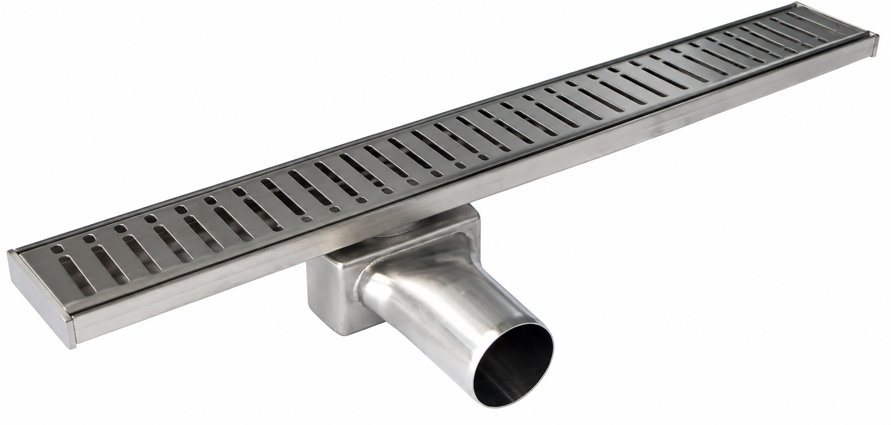
ACO Shower Channels

Shower Channels

  • Easy to install and aesthetically attractive discharge channel for shower locations
  • Shallow depth and varying lengths for new or refurbished projects
  • Stainless steel options with removable foul air trap and flow rate of 0.6 l/s

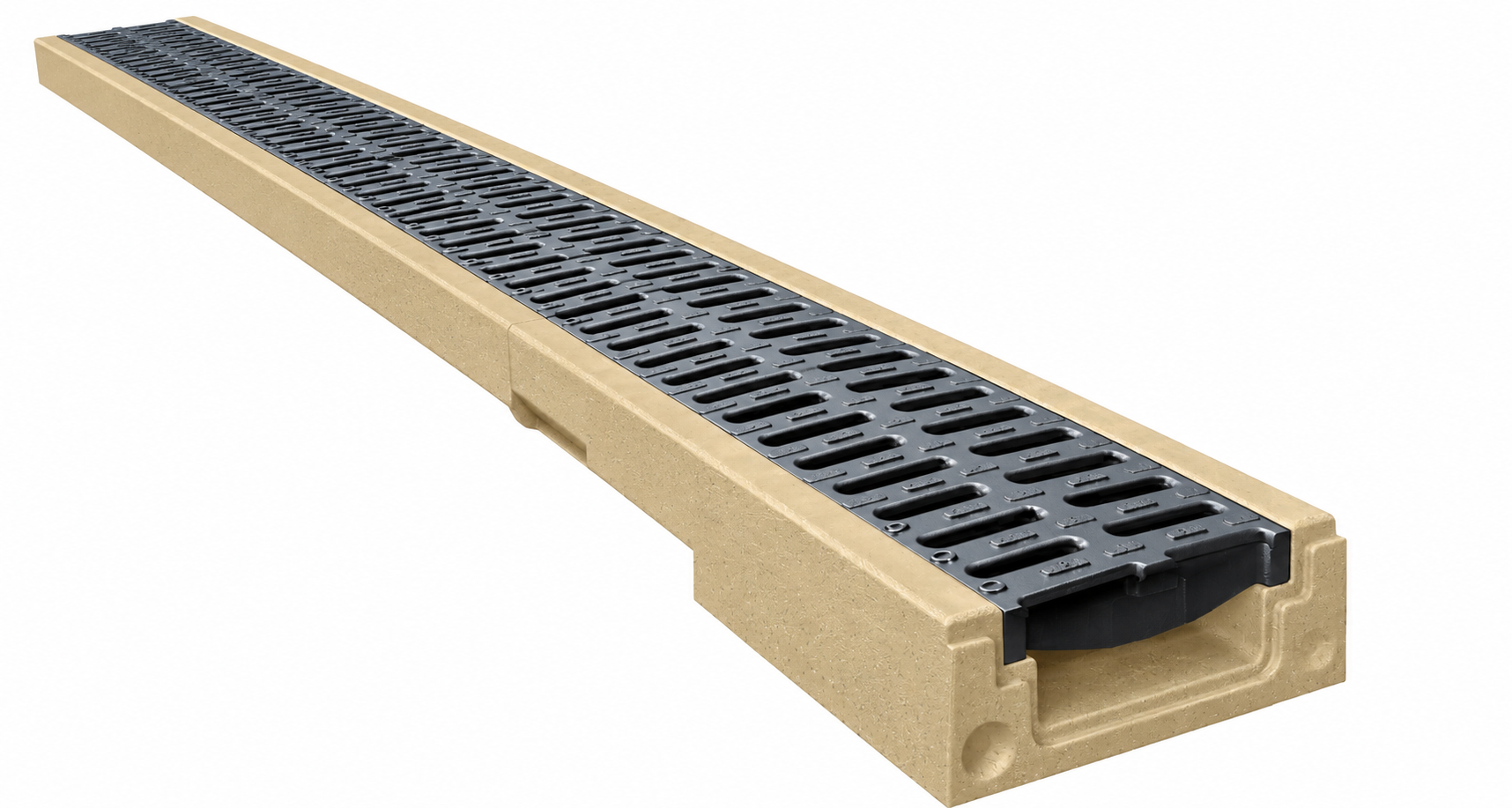
ACO Self Euroline

Self Euroline

  • Polymer concrete channel system with high strength at low weight
  • Smooth V-profile surface supports rapid water flow and self-cleaning
  • Applications include thresholds, driveways, terraces and garages; load classes A15 and B125
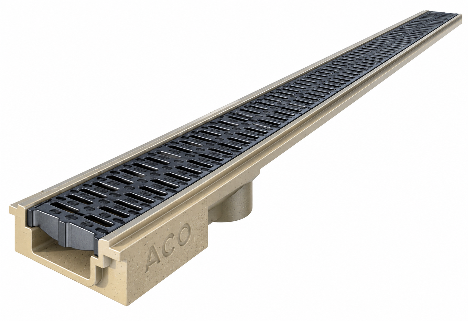
ACO Deckline P OS

Deckline P OS

  • Designed for underground garages, parking houses and multi-level car parks
  • Polymer concrete system with corrosion resistance and no steel parts
  • Low height, easy assembly and ACO SF safety groove for a watertight connection

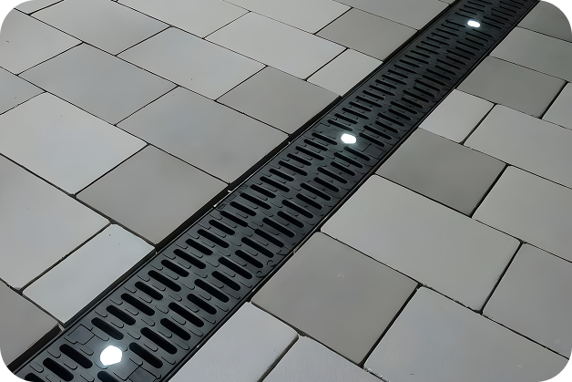
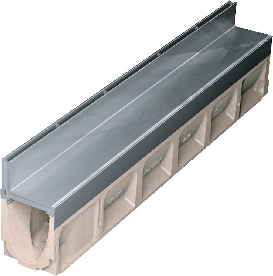
ACO Self Brickslot

Discreet slot drainage for paved areas and public landscaping
Product advantages

  • Discreet drainage solution designed to blend into brick and stone paving joints
  • High hydraulic efficiency for fast removal of surface water
  • Available in galvanized or stainless steel and suitable for 100 mm and 200 mm channel widths
  • Secure installation reduces the risk of loose gratings and supports easy maintenance through an access unit
  • Applications include sidewalks, pools, water features, threshold drainage and public landscaping
ACO Self Brickslot

Below Ground Grease Separators

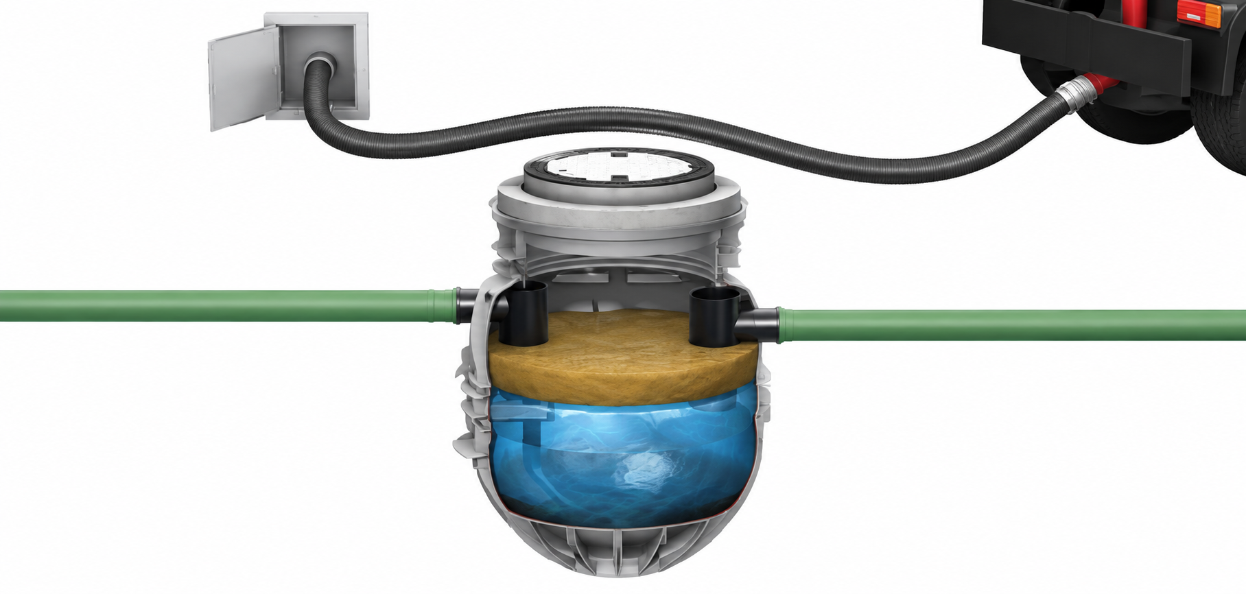
ACO LipuMax, ECO-PRI and LIPUTEC
ACO grease separator
  • Cost-effective solution for fats, oils and grease (FOG)
  • Available with manual or automatic control
  • Option for odourless disposal to vacuum tanker
  • Superior durability with a product life of more than 50 years
  • Designed for below-ground installation, with free-standing separator options also available

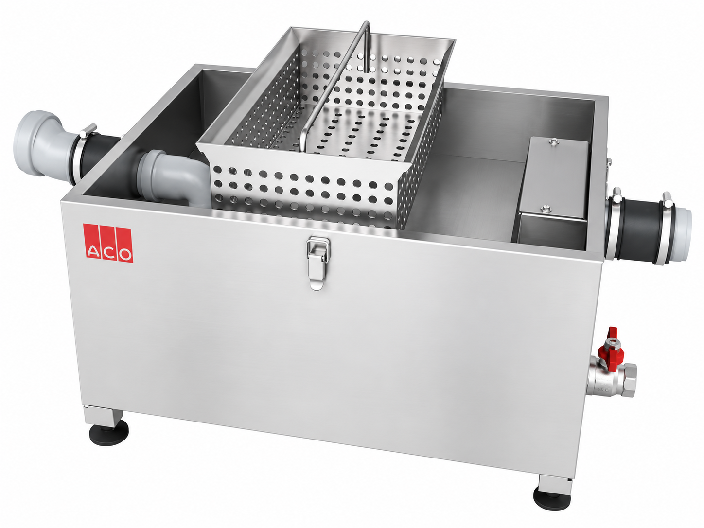
Grease Capture & Grease Trap

Commercial kitchen grease separation
ACO Grease Trap
  • Grease Capture separates grease and suspended solids from kitchen wastewater
  • Grease Trap is designed for below-sink use where space is limited
  • Stainless steel construction provides hygienic performance and durability
  • Adjustable feet and accessible connections simplify installation
  • Suitable for cafes, restaurants and smaller commercial kitchens