/* =========================================================
VAILLANT — HAMZA BRAND PAGE
Rebuilt to match the Zehnder page's single-widget,
fully-responsive system. Paste this whole file (style +
markup below) into ONE Elementor HTML widget — do not
split desktop/mobile into separate widgets, the media
queries below already handle every screen size.
========================================================= */
:root{
--hamza-blue:#212a72;
--vaillant-green:#00917e;
--vaillant-teal:#499a83;
--dark:#222;
--muted:#9f9e9e;
--line:#c4c4c4;
}
.hg-vaillant{
font-family:Inter,Arial,sans-serif;
color:var(--dark);
background:#fff;
overflow-x:hidden;
width:100%;
}
.hg-vaillant *{box-sizing:border-box}
.hg-vaillant a{text-decoration:none}
.hg-vaillant img{max-width:100%;height:auto;display:block}
.hg-v-wrap{
max-width:1520px;
margin:auto;
padding:0 6.3vw;
width:100%;
}
/* HEADER */
.hg-v-header{
height:132px;
background:#fff;
border-bottom:6px solid var(--hamza-blue);
display:flex;
align-items:center;
}
.hg-v-header .hg-v-wrap{
width:100%;
display:flex;
align-items:center;
justify-content:space-between;
padding-top:22px;
flex-wrap:wrap;
gap:12px;
}
.hg-v-logo{ width:255px; max-width:42vw; }
.hg-v-nav{
display:flex;
gap:25px;
align-items:center;
font-size:16px;
flex-wrap:wrap;
}
.hg-v-nav a{ color:var(--dark); }
.hg-v-nav .active{ font-weight:700; }
.hg-v-nav .current{ color:#00174b; }
/* HERO */
.hg-v-hero{
height:637px;
background-size:cover;
background-position:center;
width:100%;
}
/* INTRO */
.hg-v-intro{ background:#fff; padding:56px 0 58px; }
.hg-v-intro-grid{
display:grid;
grid-template-columns:1.75fr .55fr;
gap:70px;
}
.hg-v-brandline{
display:flex;
align-items:center;
gap:26px;
margin:0 0 26px;
flex-wrap:wrap;
}
.hg-v-pill{
display:inline-block;
width:107px;
height:18px;
border-radius:18px;
background:var(--vaillant-green);
flex:0 0 auto;
}
.hg-v-brand{
font-family:"Afacad Flux",Arial,sans-serif;
font-size:40px;
font-weight:700;
color:var(--vaillant-green);
}
.hg-v-intro-text{
font-family:"Afacad Flux",Arial,sans-serif;
font-size:24px;
line-height:1.25;
text-align:justify;
max-width:1030px;
}
.hg-v-intro-image{
width:100%;
max-width:640px;
margin-top:34px;
border-radius:40px;
display:block;
}
/* STATISTICS */
.hg-v-stats{ padding-top:4px; }
.hg-v-stat{
margin-bottom:58px;
position:relative;
padding-left:78px;
}
.hg-v-dot{
position:absolute;
left:0;
top:3px;
width:45px;
height:45px;
border-radius:50%;
}
.hg-v-stat:nth-child(1) .hg-v-dot{background:#00917e}
.hg-v-stat:nth-child(2) .hg-v-dot{background:#ff8d00}
.hg-v-stat:nth-child(3) .hg-v-dot{background:#9bcfc4}
.hg-v-stat-label{ font-size:24px; }
.hg-v-stat-number{
font-family:"Afacad Flux",Arial,sans-serif;
font-size:45px;
font-weight:900;
line-height:1;
word-break:break-word;
}
.hg-v-stat-unit{ font-size:24px; }
/* WATER HEATERS / 3-CARD SECTION */
.hg-v-section{ padding:74px 0 58px; background:rgba(33,42,114,.04); }
.hg-v-section-title{
text-align:center;
font-family:"Afacad Flux",Arial,sans-serif;
font-size:36px;
font-weight:800;
color:var(--vaillant-green);
margin:0;
}
.hg-v-subtitle{
text-align:center;
color:var(--muted);
font-family:"Afacad Flux",Arial,sans-serif;
font-size:24px;
font-weight:700;
line-height:1.2;
margin:20px 0 36px;
}
.hg-v-cards{
display:grid;
grid-template-columns:repeat(3,1fr);
gap:16px;
}
.hg-v-card{
position:relative;
background:#fff;
min-height:566px;
padding:48px 40px 46px;
}
.hg-v-card:before,
.hg-v-card:after{
content:"";
position:absolute;
left:10%;
right:10%;
height:14px;
background:var(--line);
}
.hg-v-card:before{ top:0; }
.hg-v-card:after{ bottom:0; }
.hg-v-card-img{
height:260px;
display:flex;
align-items:center;
justify-content:center;
}
.hg-v-card-img img{
max-width:100%;
max-height:100%;
object-fit:contain;
}
.hg-v-card h3{
text-align:center;
font-family:"Afacad Flux",Arial,sans-serif;
font-size:32px;
margin:2px 0 16px;
}
.hg-v-card ul{
font-family:"Afacad Flux",Arial,sans-serif;
font-size:24px;
line-height:1.22;
padding-left:24px;
margin:0;
}
.hg-v-card li{ margin:5px 0; }
/* GAS BOILER RANGE FEATURE */
.hg-v-range{ padding:50px 0 0; background:#fff; }
.hg-v-range-box{
background:#fff;
border-bottom:22px solid var(--line);
min-height:482px;
padding:32px 54px 54px;
display:grid;
grid-template-columns:1fr 330px;
gap:30px;
align-items:start;
}
.hg-v-range-head{
display:flex;
gap:39px;
align-items:center;
margin-bottom:6px;
flex-wrap:wrap;
}
.hg-v-range-title{
font-family:"Afacad Flux",Arial,sans-serif;
font-size:40px;
font-weight:700;
color:var(--vaillant-teal);
margin:0;
}
.hg-v-range-subtitle{
font-family:"Afacad Flux",Arial,sans-serif;
font-size:24px;
font-weight:700;
color:var(--muted);
margin:0 0 42px;
}
.hg-v-range-content h3{
font-family:"Afacad Flux",Arial,sans-serif;
font-size:32px;
margin:0 0 10px;
}
.hg-v-range-content ul{
font-family:"Afacad Flux",Arial,sans-serif;
font-size:24px;
line-height:1.3;
padding-left:26px;
margin:0;
}
.hg-v-range-image{
width:100%;
height:100%;
max-height:390px;
object-fit:contain;
}
/* PRODUCTS — TWO CARDS + LINKS */
.hg-v-products{ padding:22px 0 32px; background:#fff; }
.hg-v-two{
display:grid;
grid-template-columns:repeat(2,1fr);
gap:24px;
}
.hg-v-product{
position:relative;
background:#fff;
min-height:675px;
border-bottom:17px solid var(--line);
padding:28px 56px 45px;
}
.hg-v-product-head{
display:flex;
align-items:center;
gap:39px;
flex-wrap:wrap;
}
.hg-v-product h2{
font-family:"Afacad Flux",Arial,sans-serif;
font-size:40px;
color:var(--vaillant-green);
margin:0;
}
.hg-v-product-sub{
font-family:"Afacad Flux",Arial,sans-serif;
color:var(--muted);
font-size:24px;
font-weight:700;
margin:5px 0 6px;
}
.hg-v-product-imgs{
height:280px;
display:flex;
align-items:center;
justify-content:space-between;
gap:24px;
flex-wrap:wrap;
}
.hg-v-product-imgs img{
max-width:47%;
max-height:100%;
object-fit:contain;
}
.hg-v-product ul{
font-family:"Afacad Flux",Arial,sans-serif;
font-size:24px;
line-height:1.25;
padding-left:26px;
margin:0;
}
.hg-v-icons{
display:flex;
gap:24px;
margin-top:14px;
font-size:14px;
align-items:center;
flex-wrap:wrap;
}
.hg-v-icon-item{ display:flex; align-items:center; gap:5px; }
.hg-v-icon-item img{ width:31px; height:31px; }
.hg-v-links{
display:grid;
grid-template-columns:repeat(2,minmax(0,1fr));
gap:25px;
padding:22px 0 48px;
}
.hg-v-links a{
font-family:"Afacad Flux",Arial,sans-serif;
font-size:18px;
font-weight:700;
color:#0088e3;
word-break:break-word;
text-decoration:underline;
}
/* FOOTER */
.hg-v-footer{ background:var(--hamza-blue); color:#fff; padding:64px 0 28px; }
.hg-v-footer-grid{
display:grid;
grid-template-columns:1.25fr 1fr 1.15fr;
gap:60px;
}
.hg-v-footer-logo{ max-width:286px; filter:brightness(0) invert(1); }
.hg-v-hotline{ font-size:40px; font-weight:700; margin-top:28px; }
.hg-v-footer a,
.hg-v-footer p{
color:#fff;
text-decoration:none;
font-size:22px;
line-height:1.8;
margin:0;
}
.hg-v-copy{
display:flex;
justify-content:space-between;
border-top:1px solid rgba(255,255,255,.2);
margin-top:36px;
padding-top:18px;
font-size:16px;
flex-wrap:wrap;
gap:10px;
}
/* =========================================================
RESPONSIVE — SINGLE SOURCE, ALL SCREEN SIZES
3 breakpoints matching the Zehnder system:
tablet/large phone (≤1024px), standard phones (≤767px),
small phones (≤380px).
========================================================= */
@media(max-width:1024px){
.hg-v-wrap{ padding:0 5vw; }
.hg-v-nav{ display:none; }
.hg-v-header{ height:100px; }
.hg-v-hero{ height:46vw; min-height:280px; }
.hg-v-intro{ padding:44px 0; }
.hg-v-intro-grid{ grid-template-columns:1fr; gap:40px; }
.hg-v-brand{ font-size:34px; }
.hg-v-intro-text{ font-size:21px; }
.hg-v-stats{ display:grid; grid-template-columns:repeat(3,1fr); gap:22px; }
.hg-v-stat{ margin:0; padding-left:0; padding-top:60px; }
.hg-v-dot{ left:0; top:0; width:38px; height:38px; }
.hg-v-stat-label{ font-size:18px; }
.hg-v-stat-number{ font-size:44px; }
.hg-v-stat-unit{ font-size:18px; }
.hg-v-section{ padding:56px 0 44px; }
.hg-v-section-title{ font-size:32px; }
.hg-v-subtitle{ font-size:20px; }
.hg-v-cards{ grid-template-columns:1fr; gap:24px; }
.hg-v-card{ min-height:0; padding:40px 32px; }
.hg-v-card-img{ height:220px; }
.hg-v-range{ padding:40px 0 0; }
.hg-v-range-box{ grid-template-columns:1fr; padding:28px 36px 42px; min-height:0; }
.hg-v-range-title{ font-size:34px; }
.hg-v-range-image{ max-height:320px; margin-top:10px; }
.hg-v-two{ grid-template-columns:1fr; gap:24px; }
.hg-v-product{ min-height:0; padding:26px 36px 36px; }
.hg-v-product h2{ font-size:34px; }
.hg-v-product-imgs{ height:240px; }
.hg-v-footer-grid{ grid-template-columns:1fr 1fr; gap:32px; }
.hg-v-footer-grid > div:first-child{ grid-column:1/-1; }
}
@media(max-width:767px){
.hg-v-wrap{ padding:0 20px; }
.hg-v-header{ height:90px; }
.hg-v-logo{ width:170px; }
.hg-v-hero{ height:56vw; min-height:200px; }
.hg-v-intro{ padding:34px 0; }
.hg-v-intro-grid{ gap:30px; }
.hg-v-brandline{ gap:16px; margin-bottom:18px; }
.hg-v-pill{ width:80px; height:14px; }
.hg-v-brand{ font-size:28px; }
.hg-v-intro-text{ font-size:17px; line-height:1.4; }
.hg-v-intro-image{ border-radius:24px; margin-top:24px; }
.hg-v-stats{ grid-template-columns:1fr; gap:26px; }
.hg-v-stat{ padding-left:64px; padding-top:0; }
.hg-v-dot{ left:0; top:2px; width:40px; height:40px; }
.hg-v-stat-label{ font-size:16px; }
.hg-v-stat-number{ font-size:40px; }
.hg-v-stat-unit{ font-size:16px; }
.hg-v-section{ padding:40px 0 34px; }
.hg-v-section-title{ font-size:26px; }
.hg-v-subtitle{ font-size:16px; line-height:1.4; margin:14px 0 22px; }
.hg-v-subtitle br{ display:none; }
.hg-v-card{ padding:30px 22px; }
.hg-v-card-img{ height:180px; }
.hg-v-card h3{ font-size:24px; }
.hg-v-card ul,
.hg-v-range-content ul,
.hg-v-product ul{ font-size:16px; padding-left:20px; }
.hg-v-range-box{ padding:22px 22px 32px; border-bottom-width:14px; }
.hg-v-range-head{ gap:20px; }
.hg-v-range-title,
.hg-v-product h2{ font-size:26px; }
.hg-v-range-subtitle{ font-size:18px; margin:5px 0 24px; }
.hg-v-range-content h3{ font-size:22px; }
.hg-v-range-image{ max-height:220px; }
.hg-v-products{ padding:14px 0 20px; }
.hg-v-product{ padding:22px 22px 30px; border-bottom-width:12px; }
.hg-v-product-head{ gap:20px; }
.hg-v-product-sub{ font-size:18px; }
.hg-v-product-imgs{ height:180px; }
.hg-v-links{ grid-template-columns:1fr; gap:16px; padding:18px 0 40px; }
.hg-v-links a{ font-size:18px; }
.hg-v-footer{ padding:44px 0 24px; }
.hg-v-footer-grid{ grid-template-columns:1fr; gap:28px; }
.hg-v-footer-grid > div:first-child{ grid-column:auto; }
.hg-v-hotline{ font-size:30px; }
.hg-v-copy{ flex-direction:column; gap:10px; }
}
@media(max-width:380px){
.hg-v-wrap{ padding:0 16px; }
.hg-v-hero{ height:60vw; min-height:170px; }
.hg-v-brand{ font-size:24px; }
.hg-v-intro-text{ font-size:15px; }
.hg-v-stat-number{ font-size:34px; }
.hg-v-dot{ width:34px; height:34px; }
.hg-v-stat{ padding-left:56px; }
.hg-v-section-title{ font-size:22px; }
.hg-v-subtitle{ font-size:15px; }
.hg-v-card h3{ font-size:21px; }
.hg-v-card-img{ height:150px; }
.hg-v-range-title,
.hg-v-product h2{ font-size:23px; }
.hg-v-range-subtitle{ font-size:16px; }
.hg-v-product-sub{ font-size:16px; }
.hg-v-product-imgs{ height:150px; }
.hg-v-links a{ font-size:16px; }
.hg-v-hotline{ font-size:26px; }
}
DRIVING THE HEATING TRANSITION SINCE 150 YEARS.
Vaillant’s success story began in 1874: Johann Vaillant, the tenth child of a master tailor, broke new ground and founded his own craft business as a copper smith and pump maker in Remscheid. Today, Vaillant is the leading manufacturer of heating, ventilation and air-conditioning technology and has been convincing for more than 150 years with technological innovations and world firsts. Vaillant went around the world from Remscheid and is now present in 60 countries. Over 17.000 employees generate worldwide sales of around 3,8 billion euros.
NET SALES
3.8
EUR BILLION
EMPLOYEES
17,000
WORLDWIDE
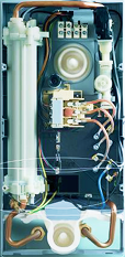
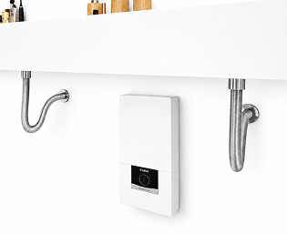
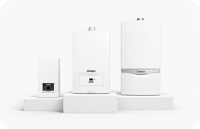
WATER HEATERS VED
Innovative technique for individual comfort
VED range
18 kw – 21 kw – 24 kw – 27 kw
Applications
- For decentral warm water supply, applicable to your demand
- Innovative technique for individual comfort: electronic VED exclusive, electronic VED plus and electronic VED
Materials
- Flat design
- Output models from 18 to 27kW (depending on the model)
- Adaptable to solar systems (depending on the model)
VED range
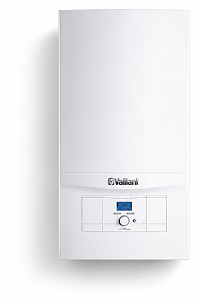
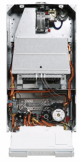
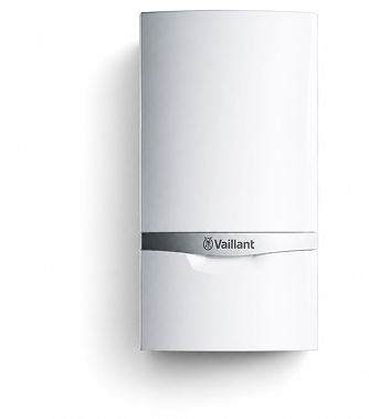
Gas Boiler Range - turboTEC plus
Natural gas is the fossil fuel with the lowest emissions
Product advantages
- High performance at up to 30% energy savings compared to older devices
- Various output sizes available, depending on the requirements
- Seamless integration into existing systems as well as possible upgrading of single boilers with a wide range of Vaillant products and accessories
- Proven technology meets Ecodesign according to new EU directives
- eBUS interface for the smart use of Internet-based controllers
turboTEC pro
Combi gas-fired wall-hung boiler
- Output 24 and 28 kW, openned and fanned flue
- Compact dimensions, low weight
- Suitable also for solar installation
- Combinable with control technology
- Easy and quick installation for user-friendly and reliable operation
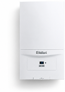
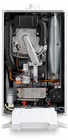
ecoTEC pure
Wall-Hung Combi Boiler
- Output versions of 19/23 and 24/28kW as mixed unit for heating and generation of domestic hot water instantaneously
- Combinable to Vaillant solar and controller range
- Combinable to Vaillant range of domestic hot water storages as well